← BACK

OVERVIEW

PROBLEMS SOLVED

FEATURES FOR FLOW

FINAL PRODUCT

CONTEXT

CONTEXT

The Path at Penn…

The Path at Penn

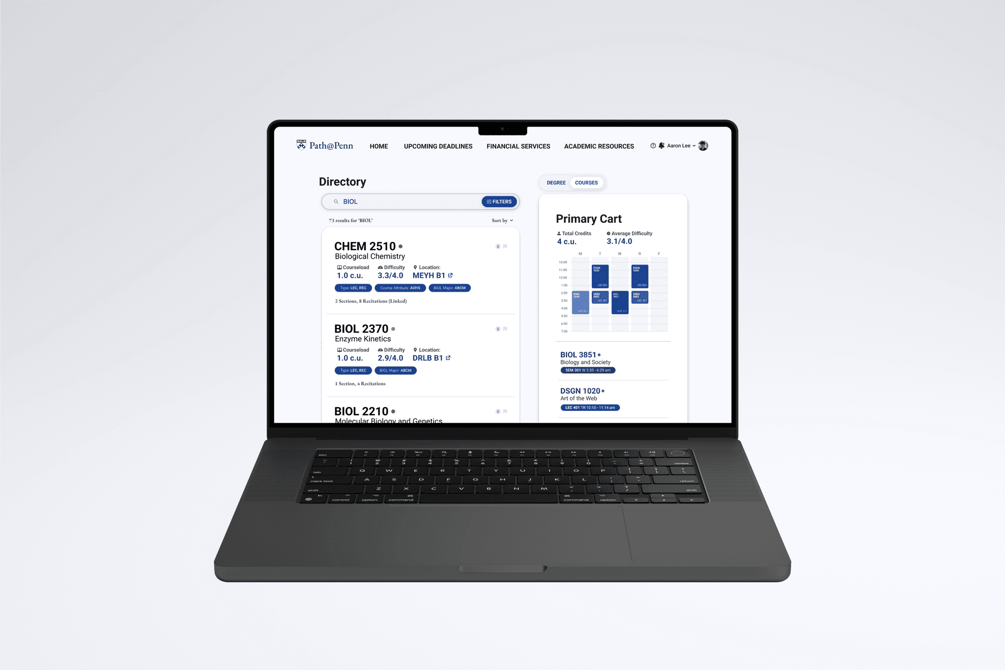
Path@Penn is the university's current portal for course planning and registration.

I redesigned the user journey to make it more personalized, productive, and pain-free.

Path@Penn is Penn's current portal for course planning and registration.

I redesigned the user journey to make it more personalized, productive, and pain-free.

I redesigned Path@Penn the university's portal for course planning/registration to fix friction in the user flow.

OVERVIEW

Path or Puzzle?

Currently, building a schedule that all fits, all while meeting one's degree requirements looks like this:

Currently, building a schedule that works all while meeting degree requirements looks like this.

Heuristics Highlight Friction

Little flexibility, consistency, and error prevention when adding courses.

KEY INSIGHTS

01
"It feels outdated and hard to use."

"It's outdated and hard to use"

"It feels outdated
and hard to use"

02
"I have to get insights from external resources."

"I have to get insights
from external resources"

"I have to get
insights from external resources"

03
"I try to avoid it unless I absolutely need [it]."

"I try to avoid it unless
I absolutely need [it]."

How might we make Path@Penn more
personalized, productive, and pain-free?

PROBLEMS SOLVED

Time Out on Time Outs!

After some time, Path@Penn would automatically sign the user out.

Especially when all course information and resources aren't centralized, reauthentication became a major pain point.

BEFORE

AFTER

Having to reauthenticate was a major pain point, especially when all course information and resources aren't centralized.

I made an Idle Timeout button to prevent this friction point. But to prevent session timeouts in the first place, I included all important info in one place:

Especially when all course information and resources aren't centralized, reauthentication became a major pain point.

I made an Idle Timeout button to prevent this friction point. But to prevent session timeouts in the first place, I included all important info in one place:

I made an Idle Timeout button to reduce friction. But to prevent session timeouts in the first place, I included all important info in one place:

Deadlines up front

I also created a dynamic landing page that brings important deadlines front and center (literally).

Course alerts

A real-time notification system for open sections (during a first-come, first-served period).

Course Insights

Easily get the insights into the courses you need, eliminating the need for 20 other tabs.

FEATURES FOR FLOW

Parsing with precision

Previously, filtering involved a small, single-select dropdown for hundreds of options.

Additionally, users could only select one criterion at a time.

This required manually cross-referencing lists and tabs to find courses that "double-count".

The Problem: filtering is currently a single-select dropdown for hundreds of options.

BEFORE

I introduced a more navigable, scalable panel to select and stack multiple attributes simultaneously.

Now, users could account for double-counting courses.

AFTER

Personalized Status Indication

No more manual schedule-checking; the course displays a status stacked against student's schedule:

I eliminated manual schedule-checking; course stacked against the user's student's current schedule would display:

  • Green (open and fits schedule)

  • Yellow (open, but a time conflict)

  • Red (closed or restricted)

Responsive Feedback

Previously, users expressed frustration not knowing which changes were pre-existing, and which ones were just made.

I introduced a way to know the exact changes one would be making to during their session.

This would allows them to discern and correct any action they've taken.

FINAL PRODUCT + REFLECTION (COMING SOON)

FINAL PRODUCT + REFLECTION
(COMING SOON)